Hi, just a feedback on the app. It would be great to have a quick access button for card options . When the card is not active there is a big black banner which brings your to the card settings which is nice , but when it is active I have to go to the menu and scroll for card settings, which seems to be one of the most frequent actions I use compared to looking at the pie chart or sending money.
I think it’s a cool idea to think about. Do you have an idea of where you’d want that button or do to be placed? In order not to overload the UI you would probably Have to kick something else.
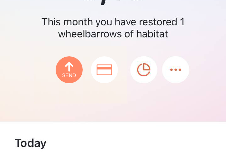
We could just use the Three-dots-menu on the startpage.
Maybe something like this? The send button seems to be takings a lot of space unnecessary . Doesn’t let me insert a picture or a link, so I had to remove https from the link
bit.ly/3etwDpE
1 „Gefällt mir“
Once you’ve been a bit more active, your trust level will increase automatically and you can post links and images ![]() it’s a spam protection measure.
it’s a spam protection measure.
1 „Gefällt mir“
Looks cool. Maybe the UX peeps will jump on the idea ![]()
1 „Gefällt mir“
Yeah, this is still very relevant, just each time I do something on my Wise app and then I go to Tomorrow, the card management UI difference really stands out not in Tomorrow’s favor.